July 8, 2022
「ウクライナ衛星画像マップ」プロジェクトThe “Satellite Images Map of Ukraine” Project

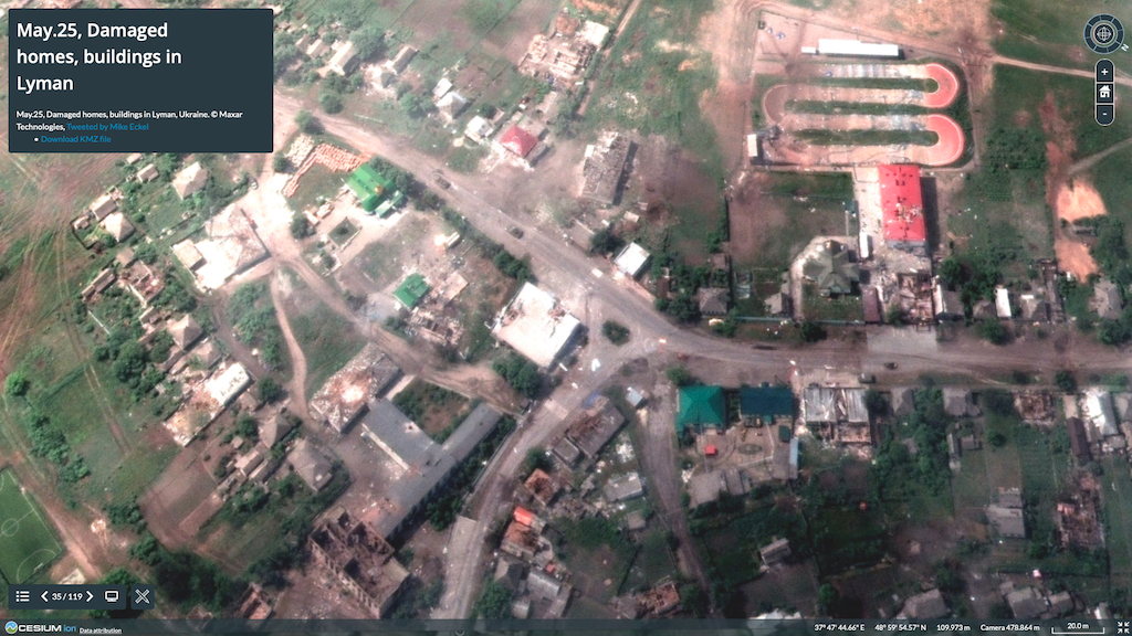
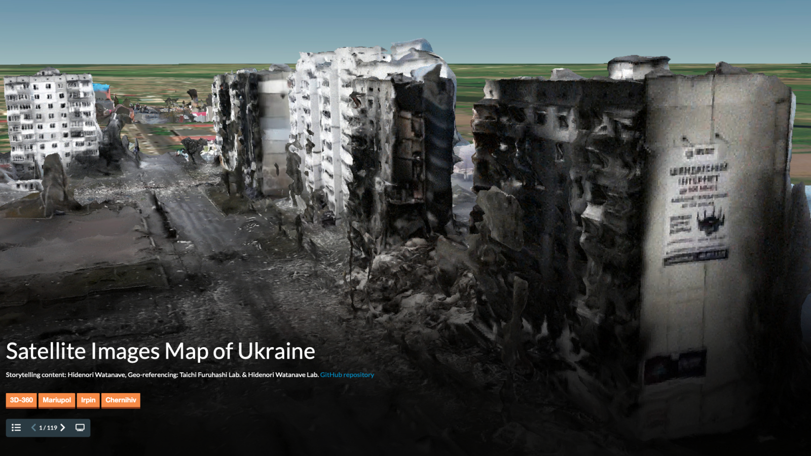
ロシアによるウクライナ侵攻が始まった2022年2月24日以降、渡邉英徳教授は毎日、彼の地の戦況が把握できるオープンソースで入手可能な衛星画像や3Dモデルを、デジタルアースプラットフォームの「Cesium」にマッピングしています。爆撃で破壊された劇場や集合住宅から保育施設まで、さまざまな現実が立体的に可視化された「ウクライナ衛星画像マップ」は静かに、それでいて雄弁に、見る者に語りかけます。
このプロジェクトの始まりは、共同研究者で地理情報システムの専門家である青山学院大学の古橋大地教授が、衛星画像企業のPlanet Lab社が提供したウクライナの爆撃を受けた空軍基地の画像を地図上に重ね合わせたデータをTwitterに投稿し、それを見た渡邉先生がすぐにCesiumにマッピングしてリプライしたことだったそうです。その後世界各地のクリエイターたちとも協働しながら、衛星画像と3Dデータのマッピングは続けられています。
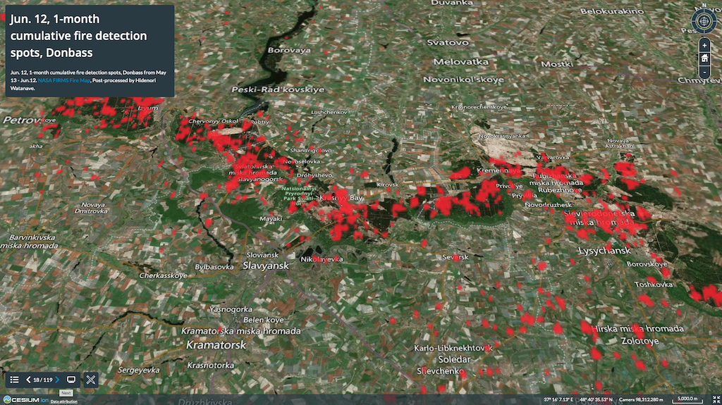
4ヶ月のうちに、渡邉先生は、衛星画像は晴れている日しか撮れないこと、また激戦の真っ只中にある地域の画像は、撮っていたとしても企業判断で配信されないといったことも把握するようになりました。1ヶ月近くウクライナ東部の衛星画像が配信されなかった時期があったそうですが、その間にヨーロッパ宇宙機構(ESA)やNASAの火災の赤外線検出システムの衛星画像などのオープンデータを観察して、そこにウクライナでの戦闘の変化を裏付けるデータがあることを確認し、マッピングするようになったそうです。逆境に置かれた時に見出した新たな複数のデータソースが、結果的にマップの精度を高めることにつながっています。
3Dモデルは、現在、激戦地となっているウクライナ・ドネツク州出身の19歳の青年をはじめ、レバノンやドイツなど多数の国において、破壊された街の様子の一端を独自に3Dデータ化している人たちによるものです。特に呼びかけたわけではないにもかかわらず、Twitterやコミュニティサイト「Sketchfab」経由で連絡を取るようになった彼らの協力を得ることができているのは、クリエイター同士のデジタルマップに対する共感があるのかもしれません。「直に会ったとしたら、まずは言葉が通じないし、交流することはなかったかもしれない。ウクライナの被害状況を世界に伝えるという共通のビジョンがあるからモデルや地図を介して対話ができるのだと思う」と渡邉先生は言います。
衛星画像や3Dデータは、たとえ座標が特定できても、ぴったり重なる場所は目視でひたすら探すしかなく、骨の折れる作業です。街のランドマーク的な建物ならともかく、手がかりのない住宅地などはくまなく見ていってようやくみつかる。そんな作業を毎日行ううちに、いまではマリウポリなどの「土地勘」が身についたそうです。
「ヒロシマ・アーカイブ」をはじめ、これまで渡邉先生が手がけられてきたデータマッピングのように、「ウクライナ衛星画像マップ」も情報デザインのスキルが発揮され、さまざまな資料やデータを可視化し、わかりやすく伝えています。しかしこれは現在進行形の戦争であり、日々状況は変化しています。渡邉先生と世界各地のクリエイターたちとの協働作業はまだ続きます。
〈LINK〉
3Dマップで可視化されるウクライナの被害 位置情報が加えられた写真の“束”が伝える大切なこと (UTokyo FOCUS, 4.1.2022)
記事:神谷説子(特任助教・編集部)
Ever since the Russian invasion of Ukraine began on February 24th, Professor Hidenori Watanave has been mapping open-source satellite images and 3D models of the situation in that country on the digital earth platform “Cesium”. Providing three-dimensional visualization of various realities, including bombed theaters, housing complexes and daycare facilities, this map, titled “Satellite Images Map of Ukraine, speaks quietly, yet eloquently, to its viewers.
According to Professor Watanave, the project began when his collaborator, Professor Daichi Furuhashi of Aoyama Gakuin University, an expert in geographic information systems, posted on Twitter a geolocated satellite image of bombarded Ukranian air force base released by Planet Labs, a satellite imaging company. Immediately on seeing this, Professor Watanave mapped the image onto Cesium and replied. The project has since continued to this day, with several creators from different countries joining the effort.
Working on this project for four months, Professor Watanave said he came to understand that satellite images could only be taken on clear days, and that images of areas in the midst of a battle were not being released, apparently due to corporate decisions by the satellite imagery companies. In fact, satellite images of eastern Ukraine were not available for nearly a month, he said. But during that time, Professor Watanave searched and analyized other open data sets including those from the European Space Agency and NASA, and mapped them as additional new information.
The 3D models were created by several collaborators from different countries including a 19-year-old from Donesk region of Ukraine, as well as Lebanese and German nationals who have been creating 3D models of the situation of Ukraine on their own. Professor Watanave believes that the digital map became a medium to connect with such creators who had empathy for the project. “If we had met in person we may not have been able to communicate because of the language barrier, but this map has allowed us to communicate because we share a common vision to show the world the destruction taking place in Ukraine,” he said.
Even if the names of places and the coordinates for their satellite images and 3D data are identified, the only way to find the exact location is to visually search for it, which is a painstaking process. Through this effort, however, Professor Watanave says he has now acquired a good knowledge of Mariupol and other areas of Eastern Ukraine.
Like the “Hiroshima Archive,” and other data mapping projects that Professor Watanave has undertaken, this latest project is an example of data visualization. But unlike other projects this is an ongoing war, and the situation changes daily. Professor Watanave’s collaborative work with creators from around the world will continue for some time.
〈LINK〉
3D maps capture scope of damage, add new dimension to Ukraine coverage Pinpointing geographical location of satellite images helps paint larger picture of war (UTokyo Focus, April 11, 2022)
Text: Setsuko Kamiya (Project assistant professor)
English proofreading: David Buist (Project senior specialist)
主担当教員Associated Faculty Members
教授
渡邉 英徳
- 文化・人間情報学コース
- 先端表現情報学コース
- アジア情報社会コース
- 情報学環教育部
Professor
WATANAVE, Hidenori
- Cultural and human information studies course
- Emerging design and informatics course
- ITASIA Program
- Undergraduate research student program